chatac
tools
ROLe
UX research, UI design, frontend engineer
Figma, HTML, CSS, Ruby, Trello
duration
June - Aug 2022
Following the 2021 takeover of Afghanistan, the Taliban placed restrictions on girls’ education access. Current tech-based services are insufficient for reaching Afghan girls, since most require strong internet connectivity and expensive gadgets.
challenge
Give students access to education! This text-based remote learning platform via Whatsapp only requires a phone and basic cellular connection for accessing self-paced coursework and automated classes. It mitigates low internet speeds and teacher shortage issues within existing programs.
solution
impact
Partnerships with over 50 international schools and 20,000 students creating remote learning curriculums and expanding accessible education. Reaches millions more students in developing countries than alternatives!
jump to:
problem
education is inaccessible to students based in remote areas
The Taliban placed restrictions on girls’ education access. Tech-based educational services should be more flexible to include self-paced coursework, automated classes, low internet speeds, teacher shortages, and cheaper gadgets. Education provided to younger generations is vital in upkeeping a stable and driven society. How do we provide the same quality of education and communication as we would within tech-savvy and in-person classrooms?
user research
how many people are affected by Taliban rule?
Because of the difficulty of reaching students in developing countries, research was performed online by reading articles and compiling statistics.
Needs accessibility: reach remote students with low internet speeds and lack of high-tech
Needs quality: remote education should still be high-quality and rewarding
Needs inclusivity: diverse range of courses and topics for students to choose from
Needs simplicity: easy-to-use on small mobile screens
Today, an ongoing ban on secondary education for girls affects more than 1.1 million students, as girls aged sixth grade and up are ordered to stay at home despite mounting international pressure.
UNICEF 2022
A recent World Bank report found that less than 1/3 of girls in low-income countries complete secondary education and estimates that limited educational opportunities could cost countries between $15 trillion and $30 trillion in lost lifetime productivity and earnings.
Wodon et al. 2018
competitive analysis
what is lacking in existing remote education platforms?
Google Classroom had many features that allowed students and teachers to stay connected while tracking and creating assignments easily. However, you are required to connect a Google account and download additional apps in order for full functionality. Zoom provided great video quality and interactive elements like screen sharing and whiteboards, but it required high speed internet. There was a need for simpler, more accessible and more intuitive user interfaces.
why is Whatsapp a good platform for remote education?
potential
Whatsapp is a platform that has 2.5+ billion users worldwide - it is the go-to alternative to text in many underdeveloped countries. We can leverage that and implement the remote learning system onto it. Millions of students are affected by inaccessible education due to internet and device problems - Chatac can become a worldwide phenomenon for them.
goals
provide users with accessible and high-quality remote education without the need for high-demanding technology
make it easy-to-use with intuitive navigation and data displays
make it accessible by leveraging Whatsapp as the main text-based app
By the end, people will always have access to education and be passionate about learning because they can connect with teachers and complete assignments easily, regardless of where they live and access to tech.
“WhatsApp was built for mobile users from the very start. Google Classroom caters more to desktop and laptop users. In order to use all of its features on mobile four apps actually need to be download: Classroom, Google Docs, Sheets, and Slides. Downloading apps in remote regions of the world is data and memory intensive, and this makes mobile-friendly platform like WhatsApp super accessible.”
Primal Dhillon - UX Collective
more coming soon….
ideation
understanding the high-level interactions
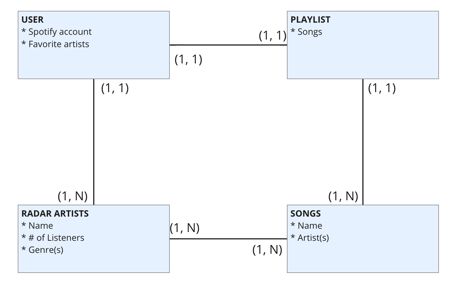
The process of creating user flows and content models allowed me to comprehend screen changes and quantitative relations between displayed elements. It contributed to my prototyping of intuitive interfaces.
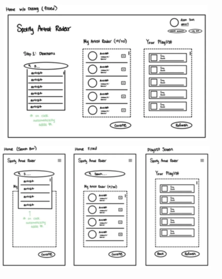
scoping out and evolving upon the good designs from simple sketches
web to mobile and back
The initial sketch contained relatively clear organization structure because I was aware of the 3 main steps during the ideation stage. However, it was difficult to translate something easily displayed on a web browser window to a small mobile screen. Those steps needed to be spread across 3 different mobile screens, bringing intuitive navigation into play.
side menus & dialogs
Experimenting with the content spacing/grouping of artist and song details allowed me to optimize the placement of images, numbers, words, and interactive buttons for deleting and moving elements.
the smaller details
How do I best display pop-up menus on mobile without detracting from the overall organization? Where should the menu collapse to and open up from? How do I differentiate between clickable buttons and read-only titles?
cultivating a trustworthy, welcoming, and reliable musical environment
In order to attract more users as a legitimate and reliable platform, Spotify Artist Radar reflects Spotify’s original palette and fonts. After experimenting with different color palettes, I realized it severely distanced and separated the app from the Spotify world. The change of trajectory allowed us to connect more.
feedback
usability testing
4 students and 1 faculty member were observed on how seamlessly they inputted their favorite artists, browsed the displayed songs, and added the playlist to their Spotify.
minimalist, matching Spotify color palette evoked trust
clear organization of the 3 main columns, step-by-step instructions guided them through the full process
Positives:
button placement was outside line of view - it was extra work to move the mouse to the top corner of the screen
mobile platform confusing to navigate due to lack of navigation buttons
Needs improvement:
iteration
One of the many issues tackled while iterating was element colors. We wanted to make the app as accessible as possible, on both web and mobile platforms. From text to buttons to links, the colors were tested for optimal contrast levels.
the final product
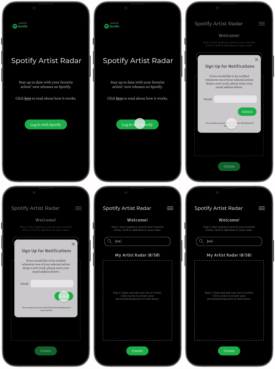
♡ easily sign in and get started
Log in with your Spotify account and get prompted by a dialog to sign up for new release notifications. Conveniently get connected!
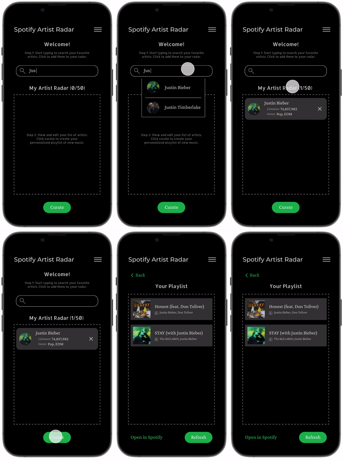
♡ freely enter favorite artists
Enter artist names and add them to the artist radar. Curate the new playlist based on user inputs. This makes it accessible for users to tailor results based on musical preferences.
into the future
next steps: always improving
Despite a successful design process, there are still many areas for improvement. Specifically, one of the main goals was to make the app intuitively usable over web and mobile, so responsive web design could be further implemented. A task that takes up one screen on web might require multiple screens on mobile. In addition, the usability tests were centered around school students and faculty. Expanding the audience and testing pool will give me more diversified feedback.
takeaways: lessons learned
Throughout this project, I learned to empathize with and advocate for my users, dive deeper for constructive feedback, and generate creative solutions to elevate accessibility. Listening actively, communicating clearly, analyzing attentively, and synthesizing efficiently allowed me to refine my design process.


