pantry palette
ROLe
UI design, UX research
tools
Figma, Figjam, Miro
duration
March - May 2022
Novice to intermediate chefs struggle to cook delicious meals easily based on what they have in their kitchen, leading them to craft up meals they won’t enjoy eating.
challenge
Following the double diamond model, I designed a recipe recommender that exposes users to creative and fitting recipes based on available ingredients, dietary restrictions, and personal preferences, with the goals of emphasizing personalization, improving eating habits, and making cooking more enjoyable.
solution
impact
Top design project presented for class, inspiring other students to follow similar design processes
jump to:
problem
Novice to intermediate chefs struggle to cook delicious meals easily
They have finite ingredients in their kitchen, tasked with following allergen and dietary restrictions or delicious and healthy cravings while cooking. Sometimes, they lack the time or experience to formulate recipes. How do we make cooking more fun and effortless?
user research
why are people struggling to find fitting recipes?
21 interviews were conducted with students, parents, and faculty. I identified the root of the problem and the main needs/painpoints when performing recipe searches.
Needs personalization: different people have different preferences and dietary restrictions
Needs convenience: cooking is time-consuming; finding the recipe should be quick and easy
Needs accessibility: allergies shouldn’t stop people from cooking great food
Needs scalability: ability to change serving sizes depending on how many people are eating
competitive analysis
what is lacking in existing recipe apps?
Cookpad and Supercook had filtering systems that didn’t allow users to personalize their recipe search as much as they should. There was a need for extra input fields and types.
most users turned to multiple platforms in order to satisfy personal needs. Let’s change multiple into one
potential
People mentioned that having one location to input available ingredients, dietary restrictions, and personal preferences would not only save time and energy, but also curate a more enjoyable and delicious cooking experience.
goals
help users embark on an easy and personalized recipe search resulting in fun and desired dining
make it convenient with quick-to-use navigation, filters, and displays
make it accessible by including a variety of input and editing fields
make it fun by allowing users to cook what they want
By the end, people will always be enthusiastic to cook because they can find fun and desirable recipes easily, regardless of available ingredients, dietary restrictions, or preferences.
ideation
understanding the high-level interactions
The process of creating user flows and content models allowed me to comprehend screen changes and quantitative relations between displayed elements. It contributed to my prototyping of intuitive interfaces.
scoping out and evolving upon the good designs from simple sketches
The two column display (left), especially on a mobile screen, renders the touch sizes too small. The information is too condensed and contributes to a chaotic and confusing interface. The recipe display (right) lacks space for images, and the cook button can be eliminated if the outer box is given a clickable functionality.
Instead of a two-column display, a horizontal view incorporating hierarchical properties makes it easier for users to enter information and edit inputs. For the recipe display, the overall space was increased by removing row numbers and the cook button.
How do I best display a multitude of information without scrolling? Experimenting with collapsible tabs and how they affect other elements on the screen allowed me to incorporate interactive components and content spacing/grouping.
Where do I place the collapsible tabs? Should +/- or up/down symbols be added onto the tabs? How do I place emphasis on the tab that has been selected? Color? Font size? Bolded/italicized elements?
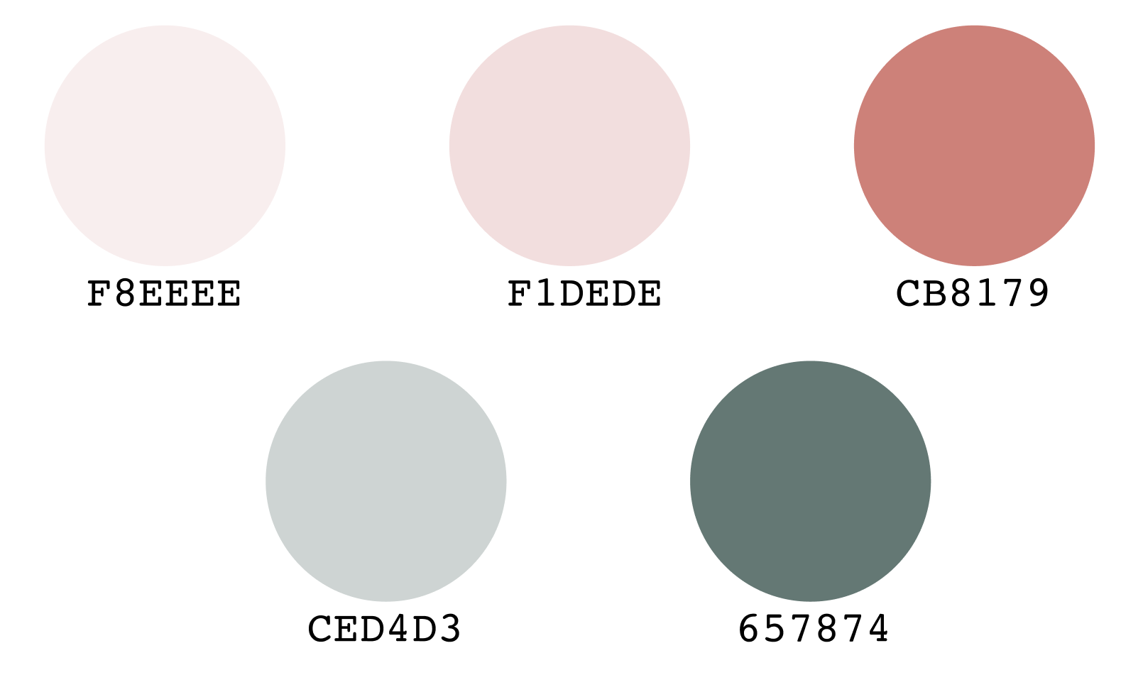
cultivating a colorful, diverse, friendly, and welcoming culinary environment
The hardest part of maintaining a food-resembling palette was choosing colors that didn’t clash or overwhelm users. The theme evolved from strong, accented shades to muted, pastel, and calmer tones.
too calm and cool
too naturey
a little too strong
just right….
feedback
usability testing
5 students and 3 faculty members were observed on how seamlessly they inputted ingredients, filtered based on preferences, and browsed the displayed recipes.
fun and welcoming color palette made app comprehensive and trustworthy
Positives:
personalized filters allowed for off-the-charts user freedom
Needs improvement:
wordy info clusters for recipe ingredients and steps
collapsible tabs were confusing to navigate because of no current location identifiers
iteration
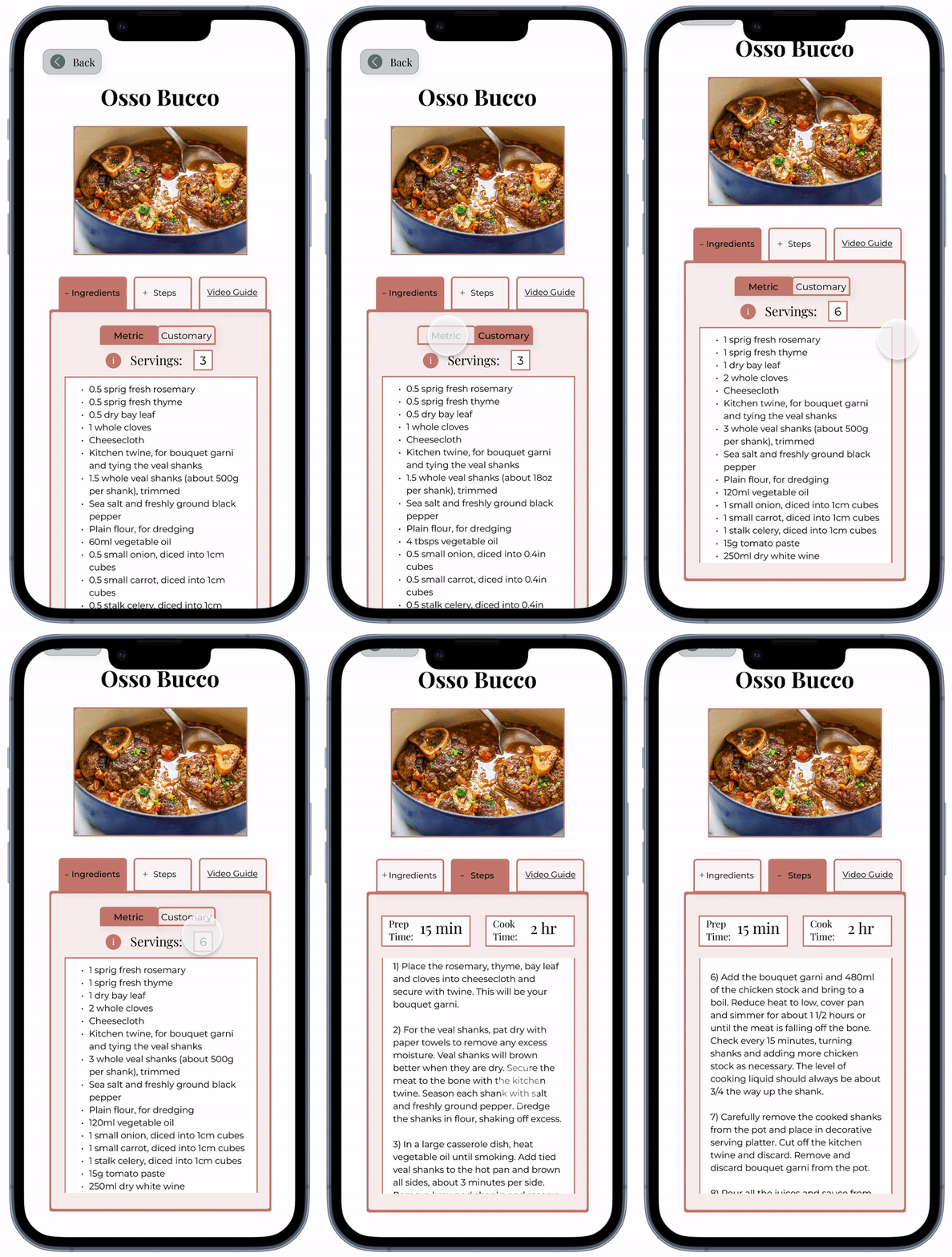
One of the many issues tackled while iterating was tab navigation; font size and decoration were edited to ensure the foreground location stood out from background elements. A small change goes a long way.
the final product
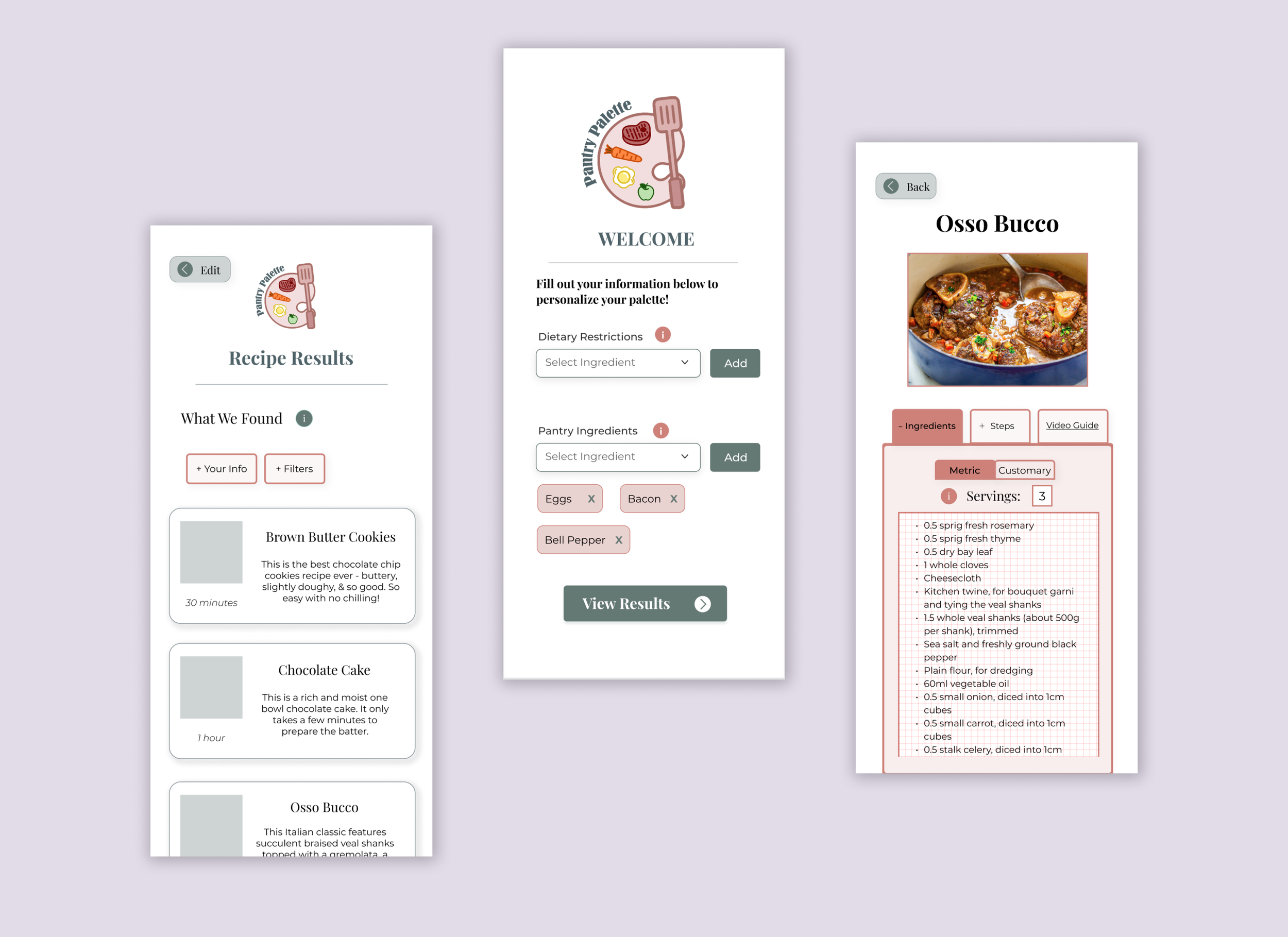
♡ easily enter user input
Search for unlimited dietary restrictions or pantry ingredients and add them to as your inclusions or exclusions. Conveniently personalize your virtual kitchen!
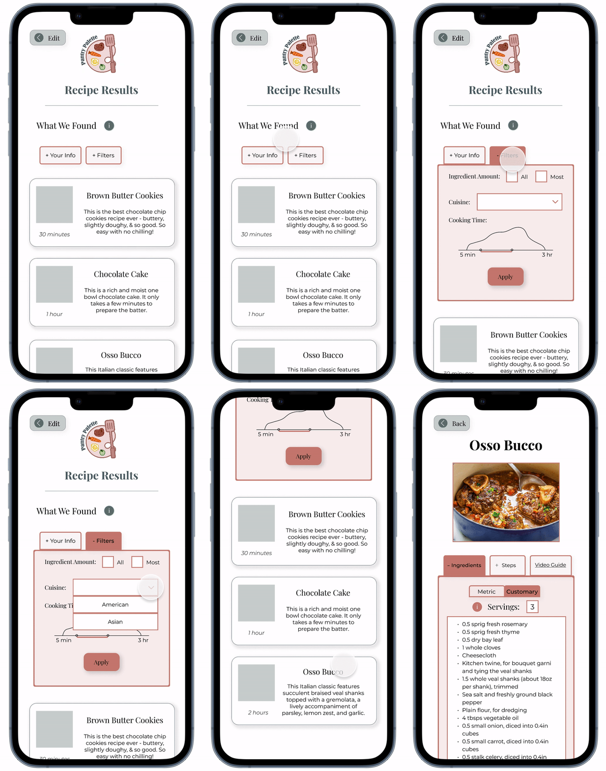
♡ freely browse recipes
Filter by ingredient type, cuisine, cooking time, and more! This makes it accessible for users to further tailor results based on more specific preferences.
♡ enjoy what you want to cook
After choosing a delicious recipe, explore the ingredients and steps while changing serving sizes and metric/customary measurements.
into the future
next steps: always improving
Despite a successful presentation to the class, there was definitely room for improvement. Specifically, longer lists of ingredients or restrictions would take up a lot of screen space. A more compact display will add simplicity and ensure intuitive comprehension. In addition, the usability tests were centered around school students and faculty. Expanding the audience and testing pool will give me more diversified feedback.
takeaways: lessons learned
Throughout this project, I learned to empathize with and advocate for my users, scope out potential areas for improvement, and thrive off the process of iteration. I elevated my skills of listening actively, communicating clearly, analyzing attentively, and synthesizing efficiently. Thank you to my professors at AIT-Budapest for pushing me to do my best!


